
OrbyAI Dashboard Redesign
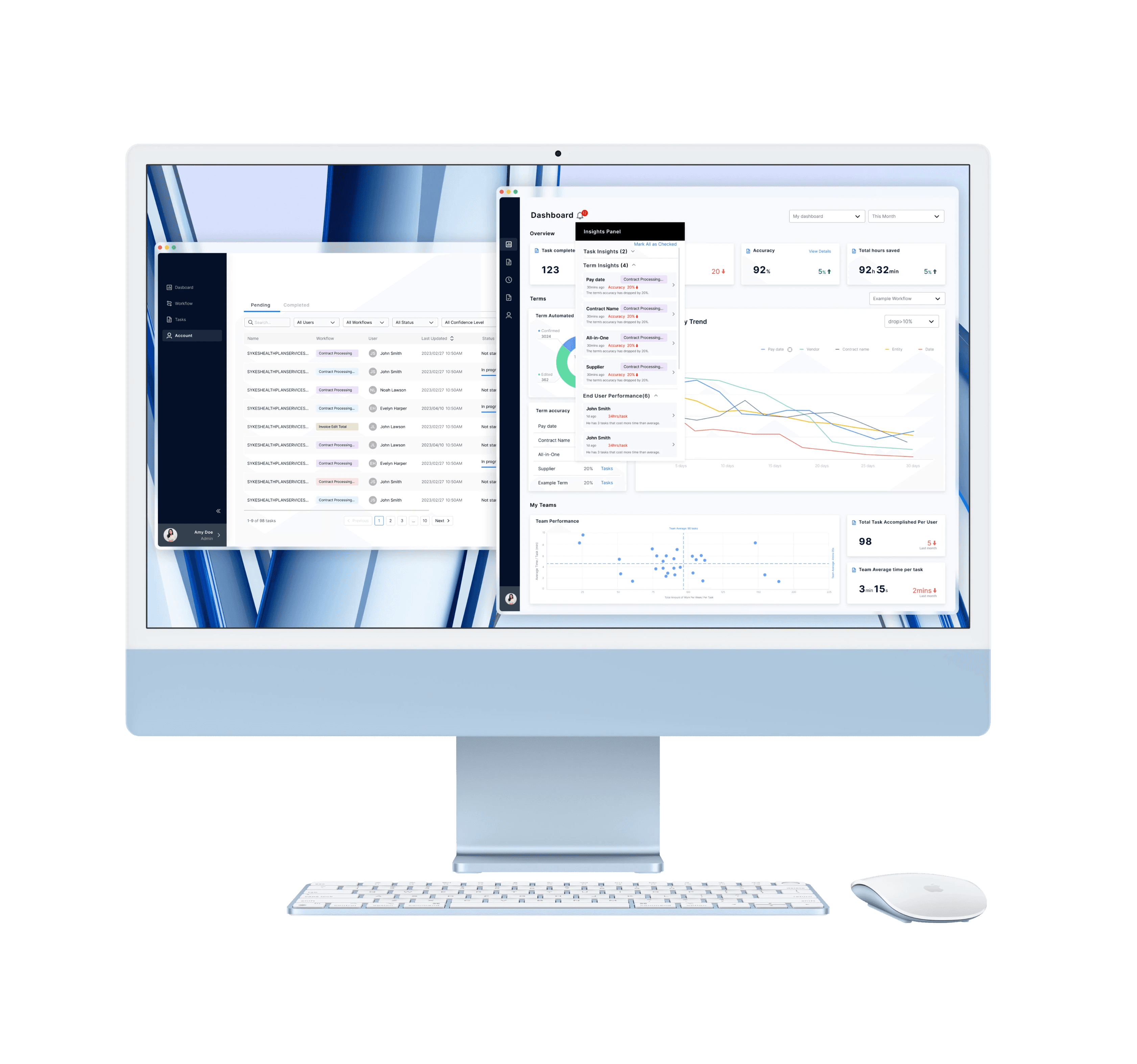
Dashboard redesign for OrbyAI (in collaboration with Google Cloud), an AI product helps business users automate extraction of document terms.
Project Type
Launched
B2B Enterprise Software
ML & AI
Impact
Significantly improve the productivity of Google's special analysts and administrators.
Based on the new design, OrbyAI acquired new clients, like Uber.
Contribution
Information architecture design
Visual design of the Dashboard and task management page
Feb. 2023 - Apr. 2023
Project Overview
What is OrbyAI?
Document Processing Interface
Original Dashboard Interface
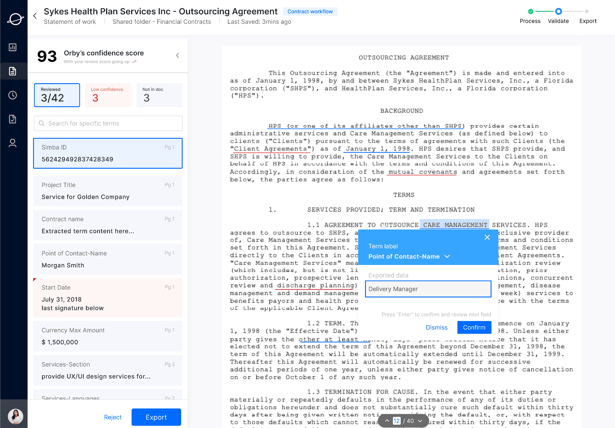
AI Based document processing software
AI based RPA software, Term extraction, turns unstructured data into structured data.
Improves with human feedback
Human feedback of AI output is essential so that AI can learn from the mistakes and keep getting better.
Learns what user did and does it for the user
Orby observe and learn user's repetitive work, and then automate the work for the user.
In Collaboration with Google Cloud
Orby AI is collaborating with Google Financial Team to provide document automation services.
Business Goal of Our Client:
To showcase OrbyAI's efficacy and boost sale.
Meet OrbyAI's User

Document Processing Interface
There are two types of user: Administrator & End User.
Their responsibility and objectives as follows:

Carol Andre
Administrator
Need:
monitor AI and end users efficiently.
Responsibility
Define workflows and Assign tasks to end users.
Ensure that tasks has been done correctly.
System monitoring Identify system biases and identify outliers.

Michael Lee
End User
Need:
monitor AI automation Efficiently.
Responsibility
Verify key terms extracted by Orby AI.
Monitor the extraction process and make sure key terms extracted by AI software is correct.
The Problem
Limited information
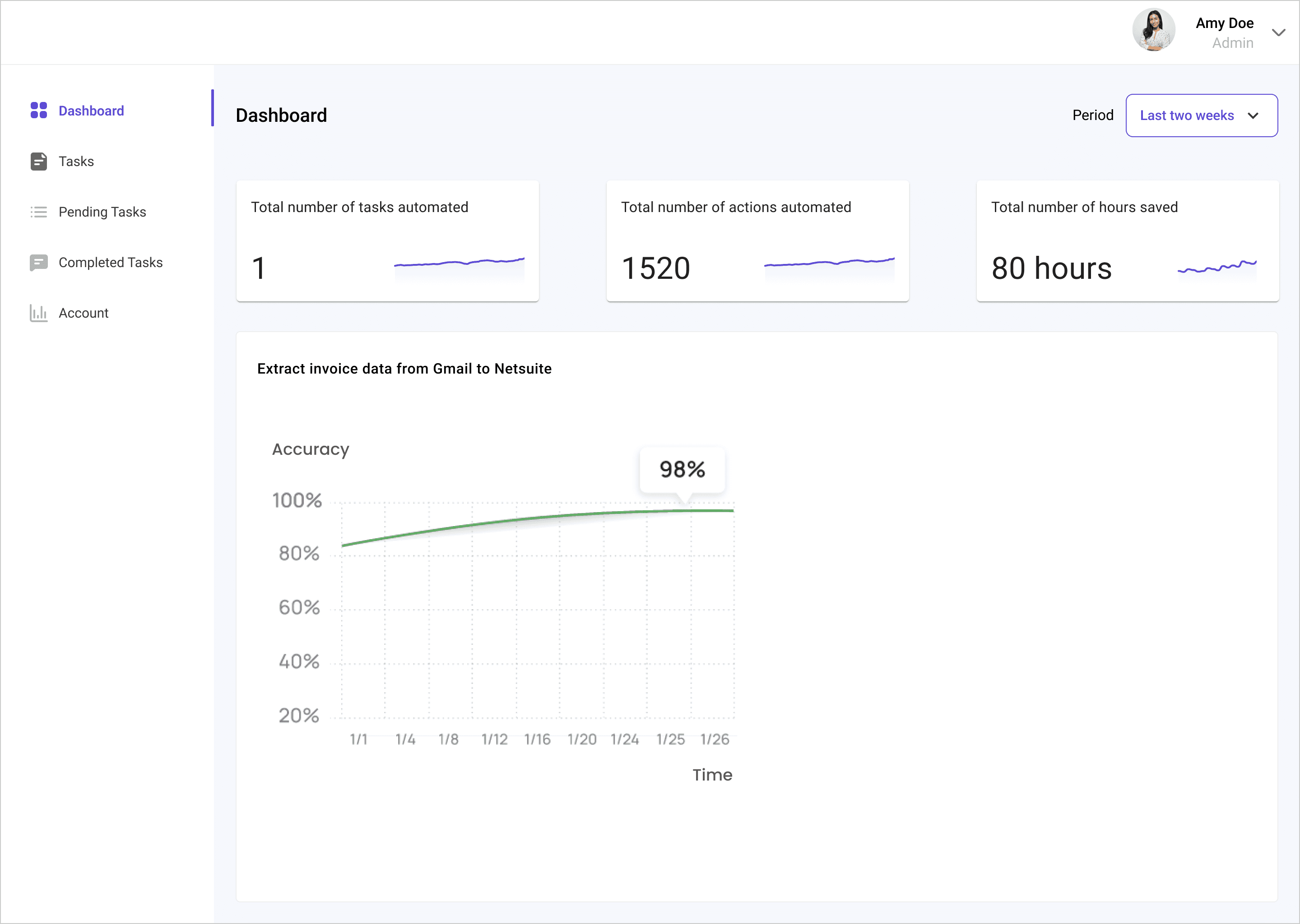
The original dashboard design only showcasing technical metrics and efficacy data of OrbyAI. Admin and users can't get a sense of team and AI performance efficiently.
No way to drill down
Even if the metrics indicates potential AI error or human misbehavior, there is no effective way of drill down to the specifics detail of the issue.
Lack of communication clarity
Lacks clarity in communication. Technical jargons makes it difficult for users to understand, causing confusion

Original Dashboard Interface
Design Question
How can we create a dashboard that addresses the business requirements of our client while also meeting the needs of both admin users and end users?
Solution Highlights
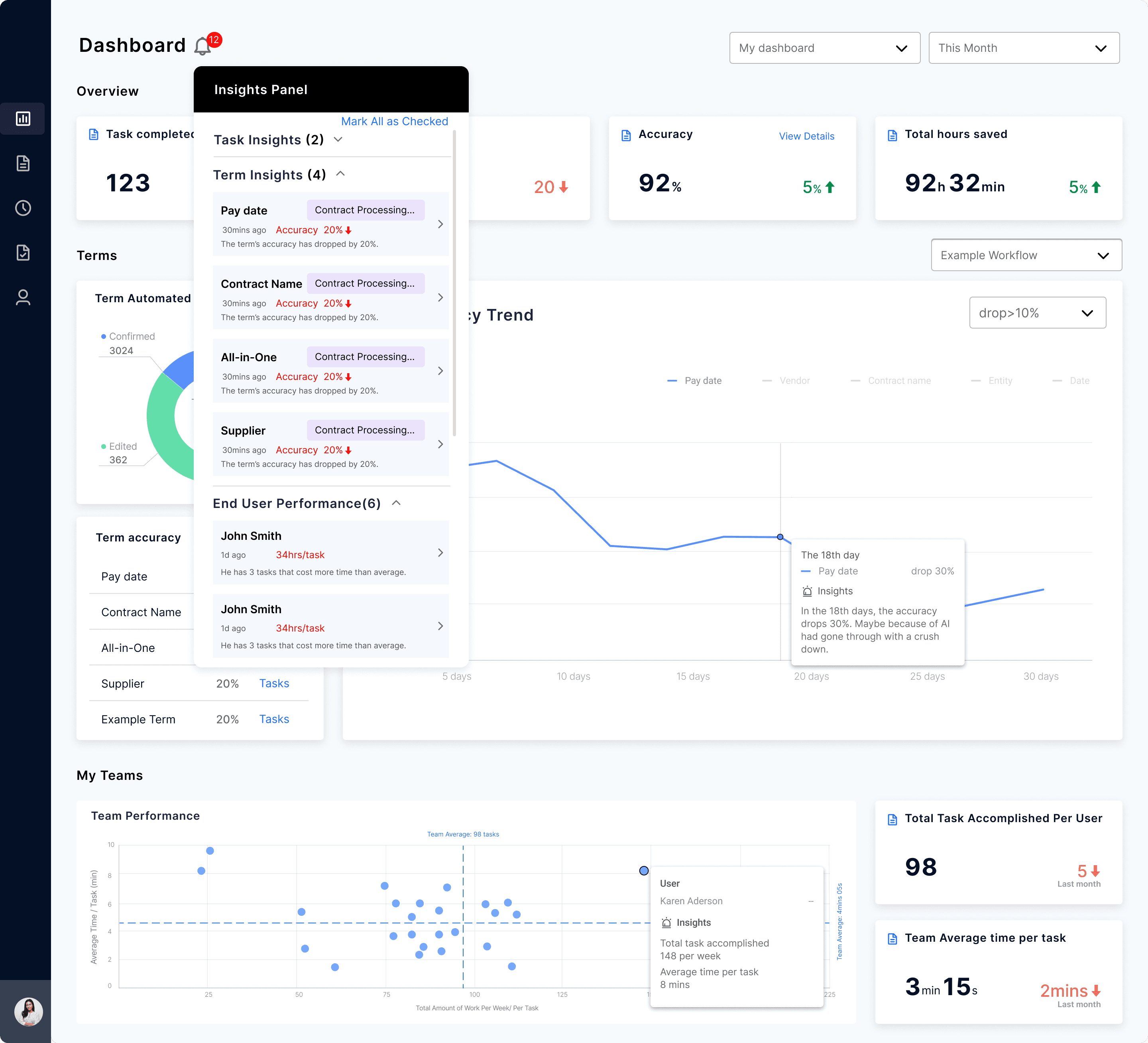
AI Automation Insights Panel
AI insights panel provides a quick sense of what need their attention, and what need to drill down.

Administrator
Carol Andre
Easy Team Monitoring
Intuitive team performance Visualization for admin to identify bad performers and outliers.

Administrator
Carol Andre

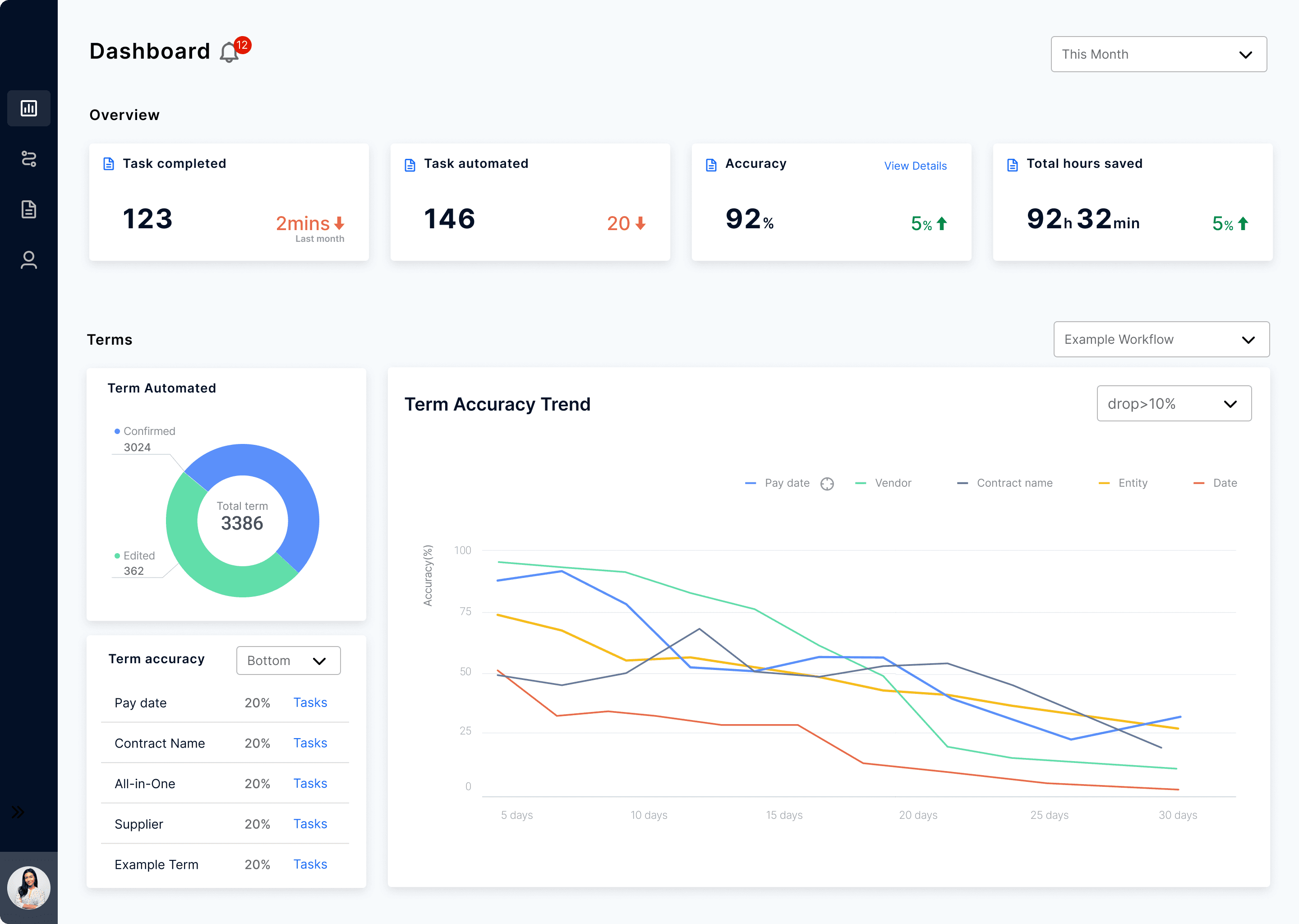
Quick check of metrics and performance
Carefully selected information listed on dashboard helps user get a sense of their progress and statistic trend.

End User
Michael Lee
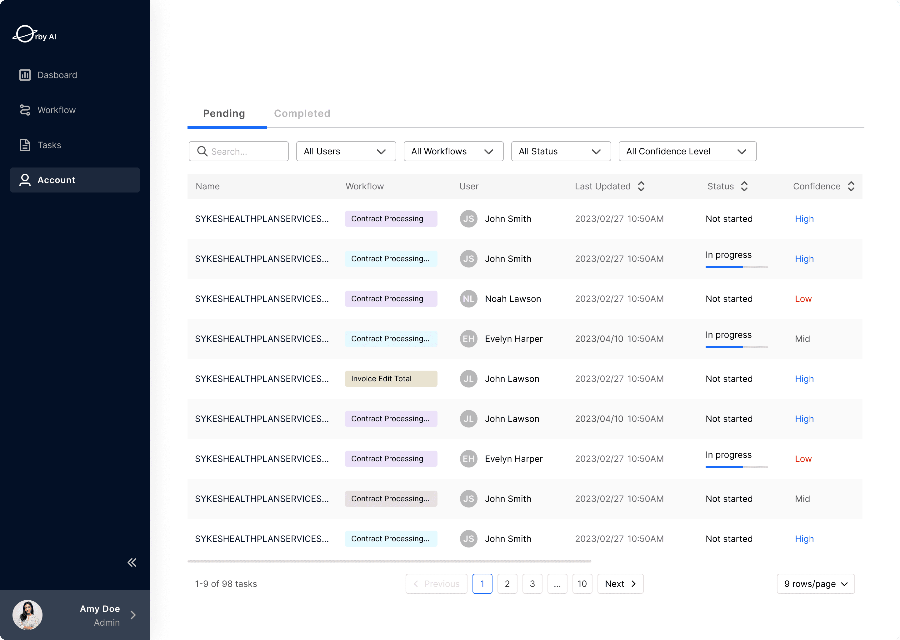
Keep Tasks Organized
Redesigned task view makes it easy for users to monitor task progress and drill down to automation details when necessary.

Administrator
Carol Andre
Research
Competitor Research





01
Avoid Information Clutter
Too much information can be distracting. Organize information using a proper hierarchy and utilize micro interactions to reduce clutter and offering ways to drill down.
02
Visualize Data Wisely
Different forms of data visualization speaks to the users differently. A good data visualization can help users make the right decision quickly.
03
Keep Tasks Organized
it is important to keep tasks organized as they pile up, so they are easy to navigate. Filters, tabs, and search features are useful to keep many tasks organized.
Stakeholder Interview
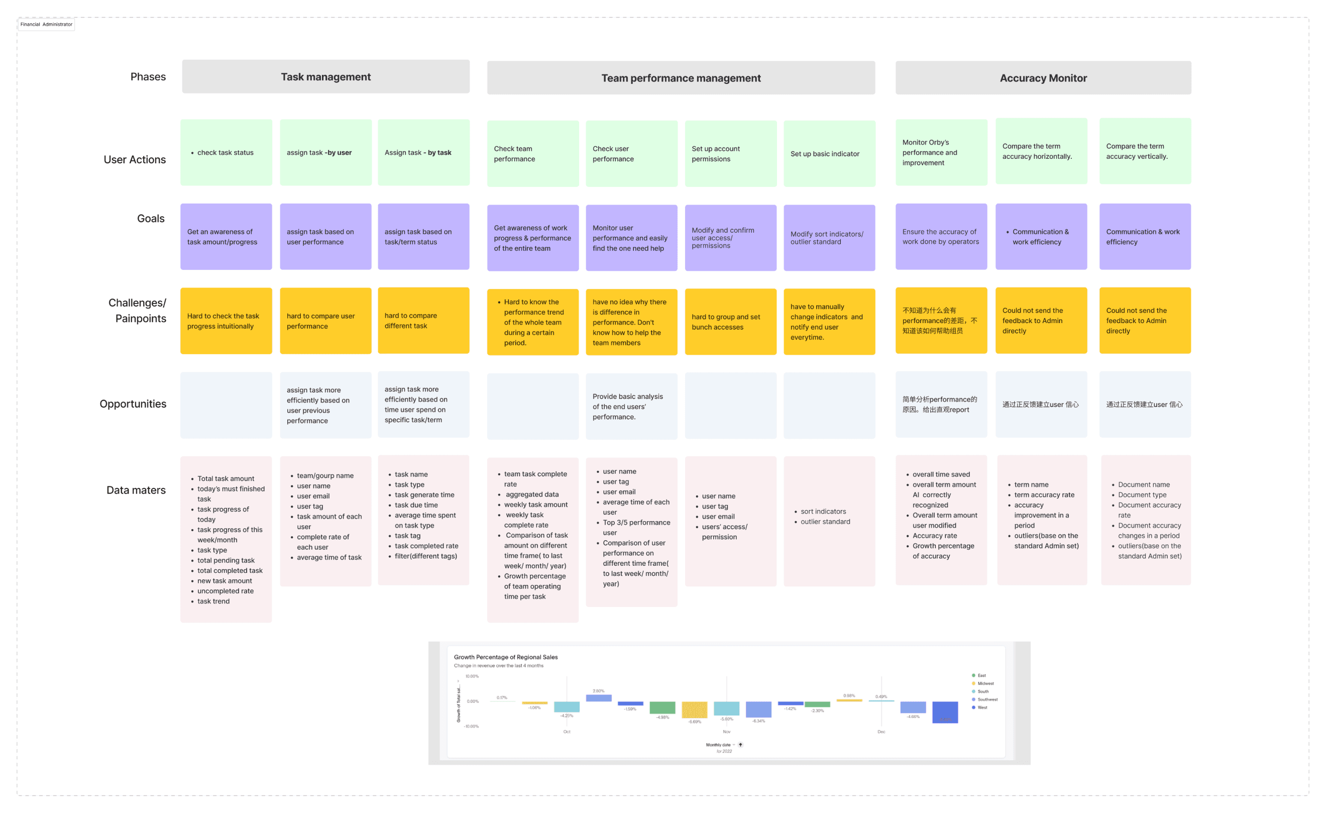
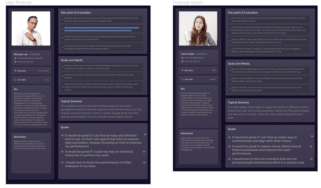
Information architecture
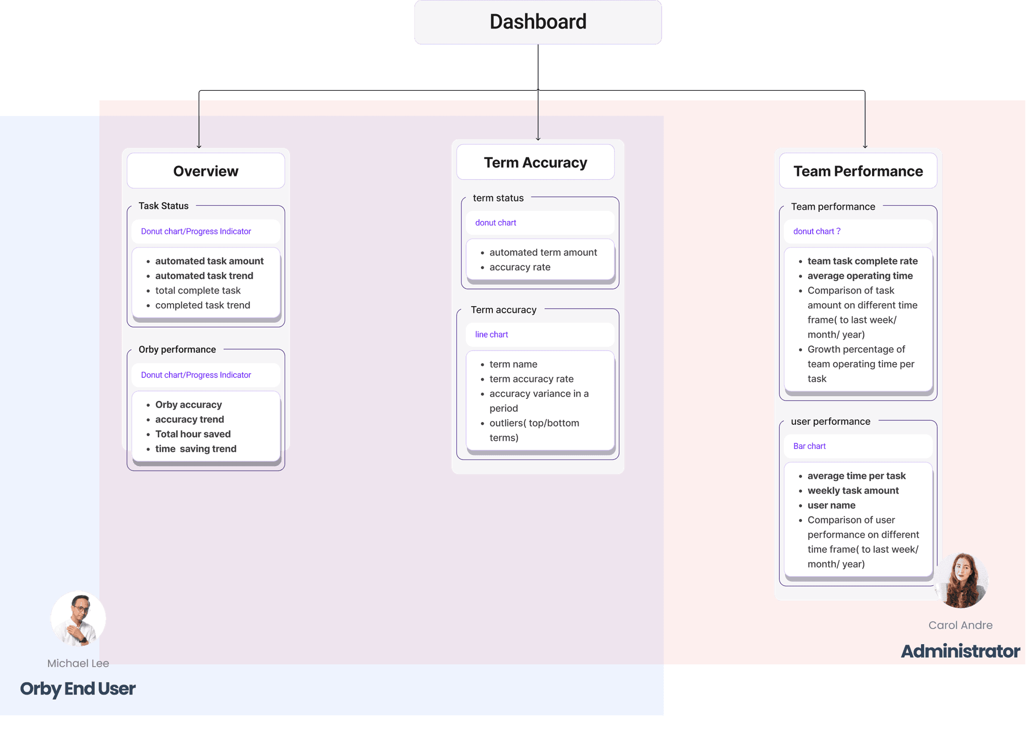
We organized information architecture based on the insights from competitive analysis and stakeholder interview.
What Carol Cares
Team Performance Monitoring
Aggregated results for all users,
Accuracy and improvement of the work that has been done,
Team Correctness and Efficiency
Number of tasks automated,
data actions automated
time saved
Identify Potential Misbehavior
Identify outliers and find system biases to better trouble shoot and take actions.
What Michael cares
His Performance Overview
Clear overview of his performance
His performance compare to peers
Correctness and Efficiency
Ensure the correctness of his work and improve efficiency via data analysis.
Prioritize
Needs to know which specific terms to focus on when reviewing, which have a lower confidence rate, to make sure they are correct.
Design
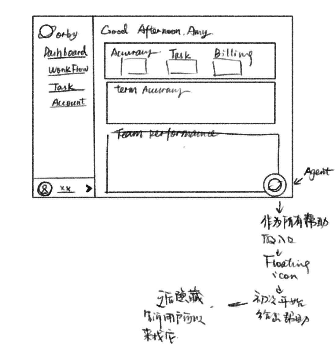
Layout Exploration
We began with two experiments of possible layouts, One is vertical stack with 4 columns, the other is a more freeform
Vertical
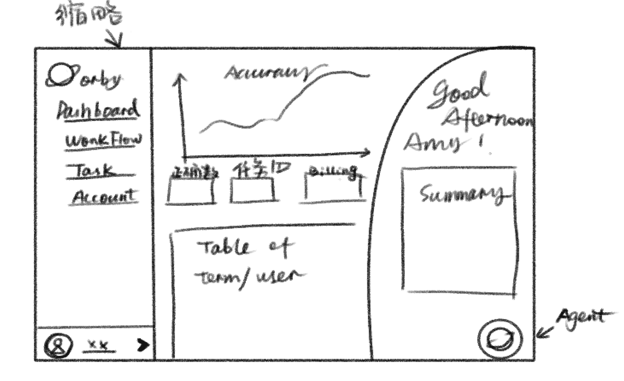
Tri-column
Since this project already had a design system in place (Ant Design), we quickly put together a Mid-Fi page.
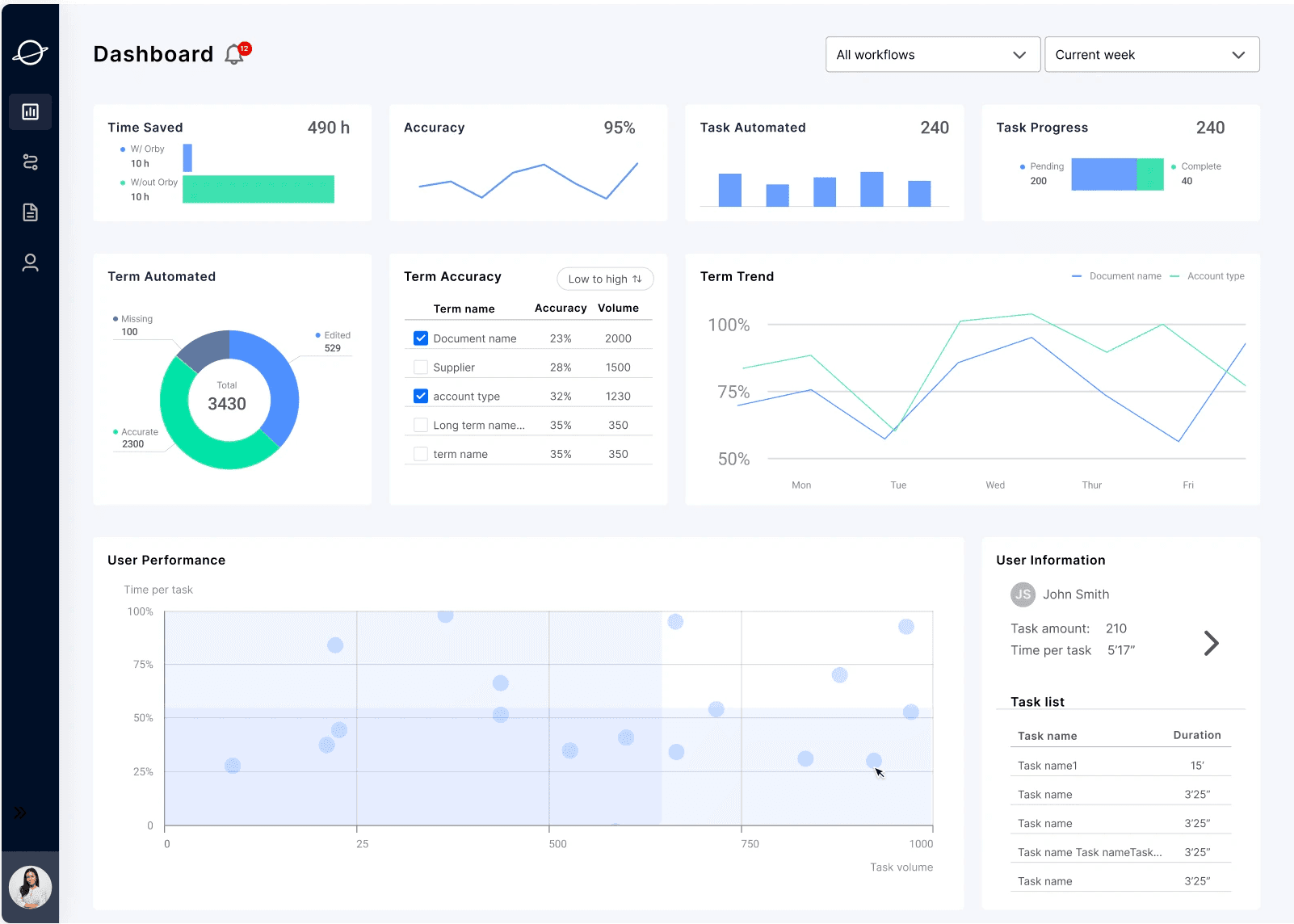
Vertical(final pick)
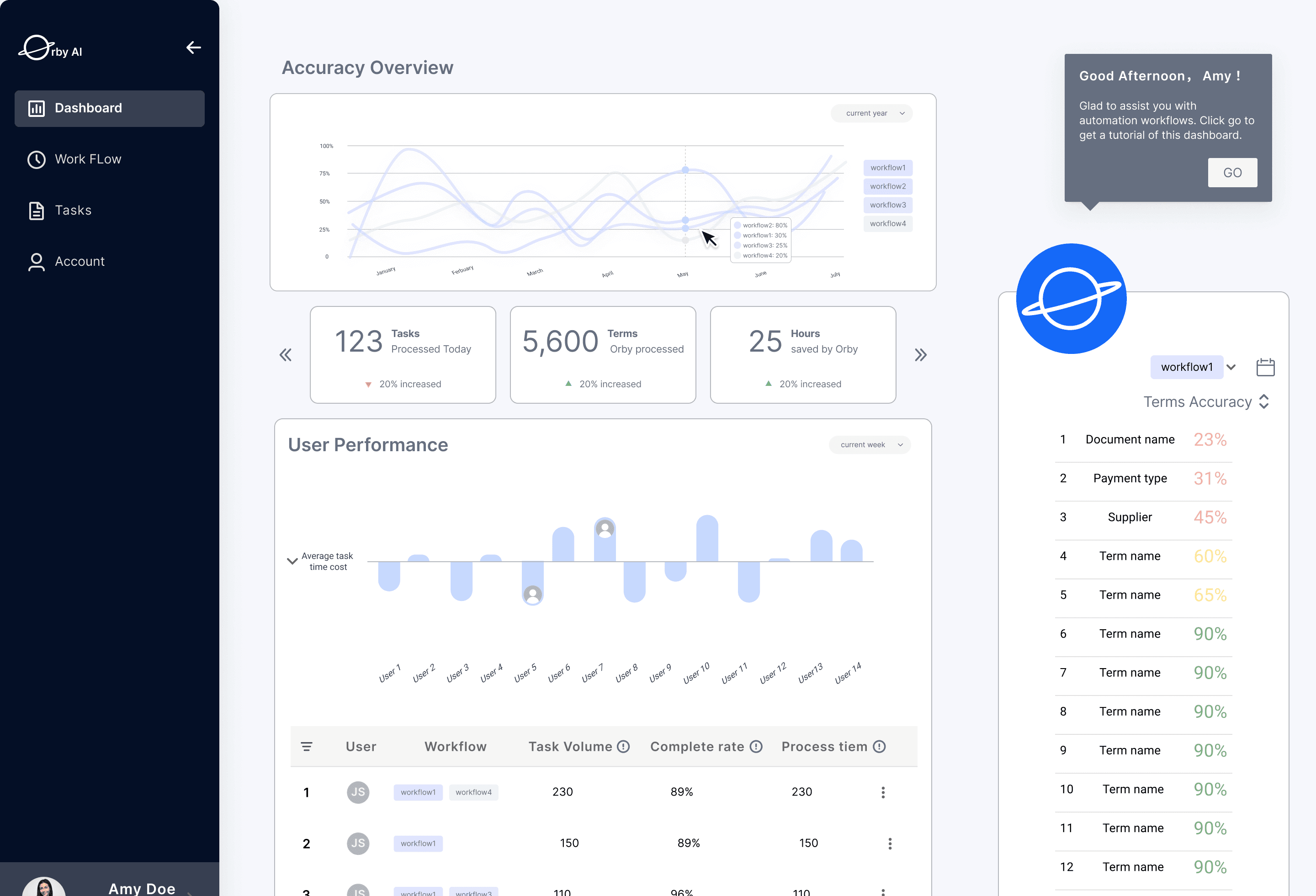
Tri-column
As we move forward and talked with engineers and project managers, we decided to go with the vertical 4 column layout for better layout responsiveness.
Layout iterations
Iteration 1: Admin Dashboard layout
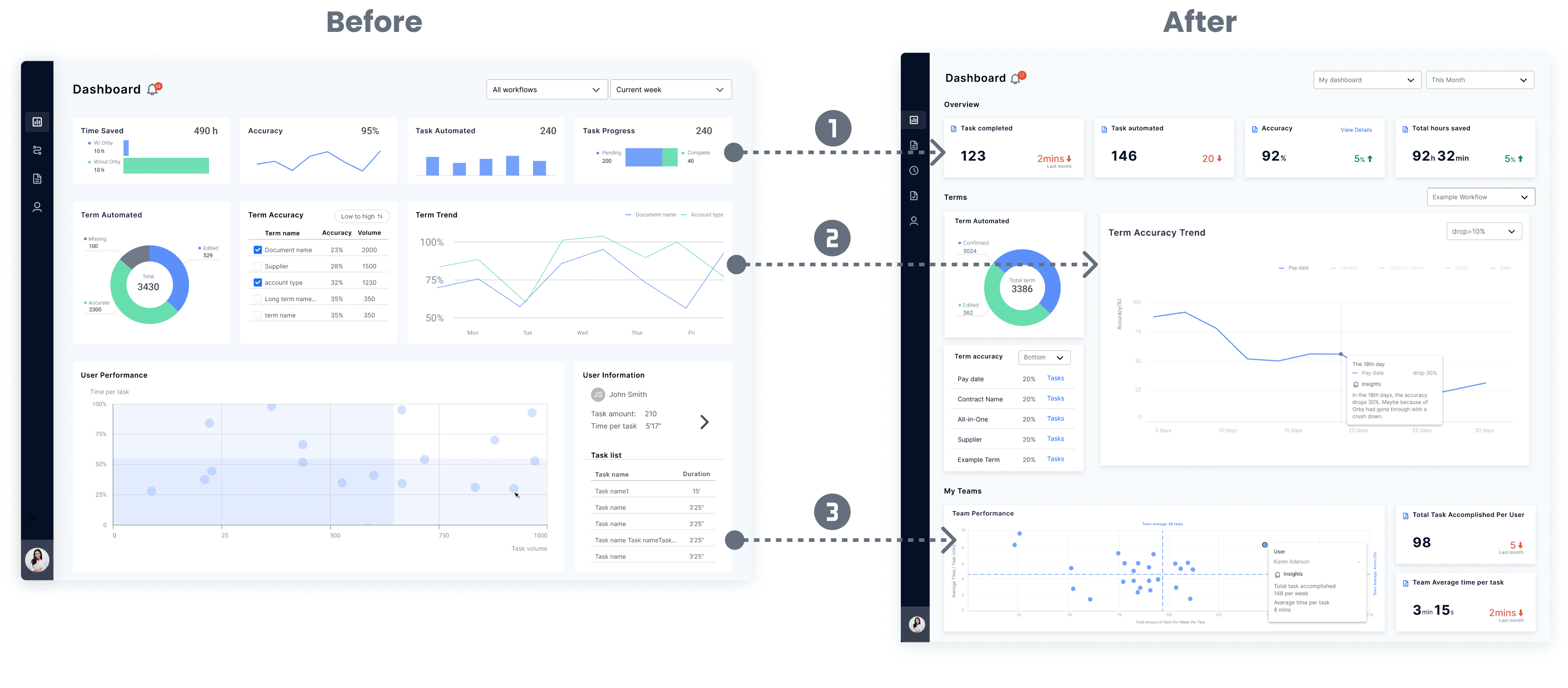
Numbers instead of Graphs
The iterated design uses numbers to help users interpret aggregated data quickly. Trend data is also displayed along side.
hierarchy& Insights
To better visualize the term accuracy trend, the graph was enlarged and other related data was stacked vertically and put alongside the trend graph.
more efficient team monitoring
The iterated design of bubble chart and aggregated data panel allows administrator to better monitor overall user activities and identify outliers, and drill down when needed.
Iteration 2: Admin Task panel
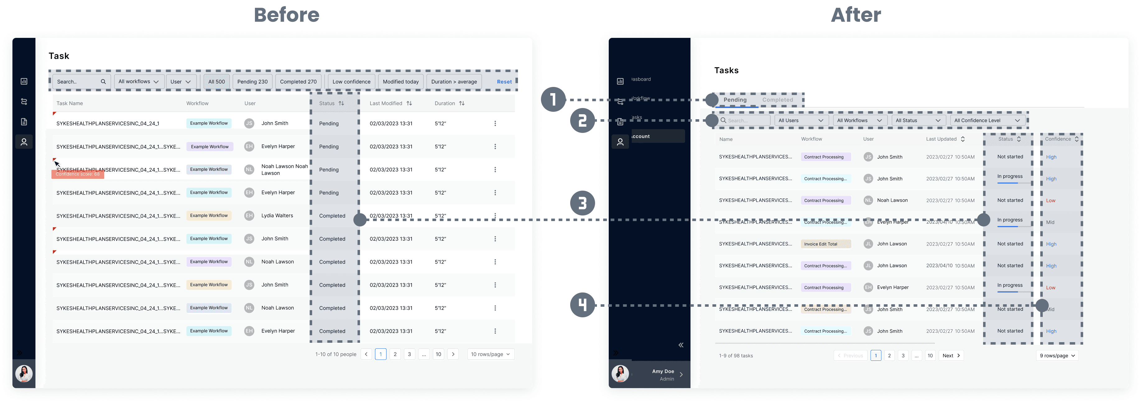
Split by completion status
The new design separated the tasks into pending and completed sections to keep tasks organized and help admin speed up the operation.
Search and filter
The iterated filter design is smoother, the data structure is more organized, and also takes into consideration of admin’ priority.
visualize completion progress
The new design uses progress bar to let admin know the status of the tasks. Higher data density keeps admin informed about what is going on.
Add confidence level
The new design displays different information hierarchy based on admin’s need. Displaying confidence score is important for admin to identify outliers.
Final Design
Admin: Insights panel

Carol Andre
Administrator
Senario 01
When admin come to the dashboard, trying to easily get a guidance of what she needs to pay attention today.
Feature 01
click the insight panel, Carol noticed that certain terms and low-performance end users were showing up frequently. So she plan to investigated further and found the discrepancies and errors that were responsible for the low performance.

Admin: team performance

Carol Andre
Administrator
Senario 02
Carol come to the dashboard to check the team performance. She would like to quickly find the outliers in the team.
Feature 02
By hovering at the scatter of the user Karen Aderson, there will shows the detail of Karen’s performance. Karen finished 148 tasks this week and his average time per task is 8 minutes. compare with the average duration of 3 mins 15seconds, Karen spent over twice of the time deal with tasks. Carol decide to book am 1 o 1 meeting with Karen.

End User: Daily checking

Michael Lee
End User
Senario 03
Before Michael started his daily job to validate AI software suggestions. He would like to know if there is any term he need to pay attention to.
Feature 03
Micheal sort the terms accuracy to check the bottom 5 terms. He noticed hat the “pay date” there is the lowest accuracy in the ranking. He select it and hover the line chart to see its trend. the insights shows him that the “pay date” has dropped 30% in the past 18 days. He has to check it more carefully in the document.

Dashboard component Design
Iteration 1: Admin Dashboard layout
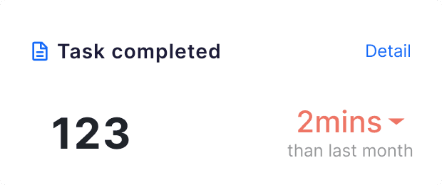

the Card
Clearly display data and trends, and provide access to view details
universal filter
Control the whole page, instead of providing separate control for each module, avoiding conflicting information across different panels.
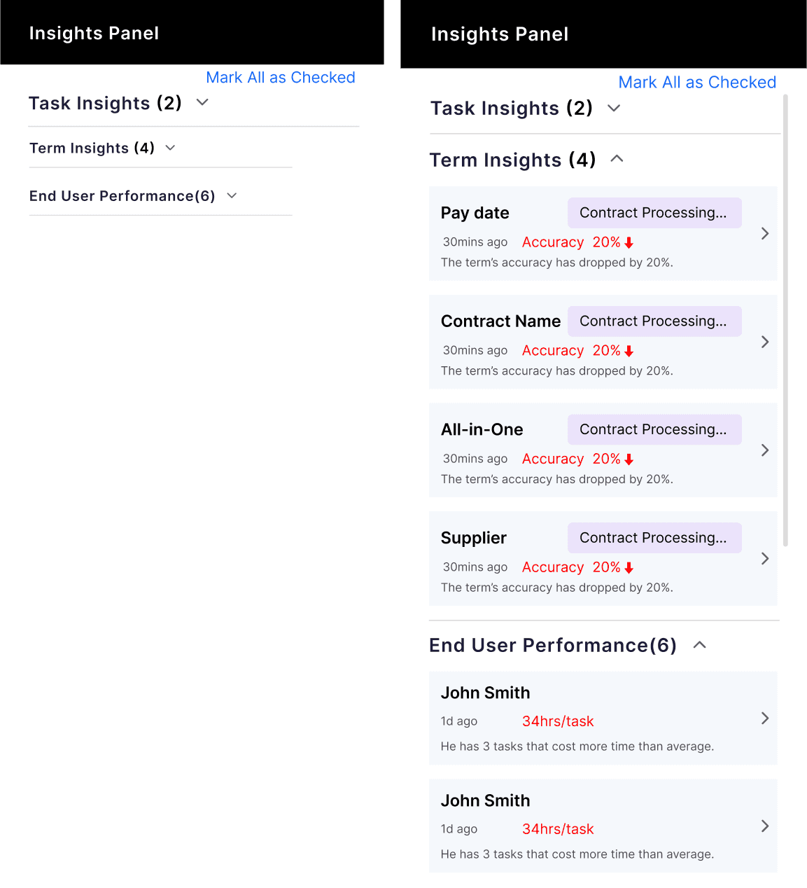
the Insight panel
Give user a brief alert of outliers among task, term and end users.
Once expanded the admin/ user could have a quick navigation to the specific item they would like to check.
Evaluation
Reflections
Iterate with stakeholders
weekly meeting with stakeholders helped us found the accurate direction and optimized the exiting design.
Prioritize feature
Because of the hard deadline of implementation. we have to give up some features. Prioritizing helped us present the dashboard better.
Future actions
Customize Layout
Provide users with more flexible layout solutions according to their operating habits.
Auto report generation
Automatically generate weekly reports about AI software performance, including AI software trend and task summarization.
